

Ծխախոտի տուփ
The Cigarette Box: Design, Function, and Cultural Significance The cigarette box is a small yet meticulously designed container that serves both practical and symbolic purposes. Typically made from thin cardboard or paperboard, it is engineered to protect the cigarettes inside from damage while maintaining their freshness. The standard box holds 20 cigarettes, arranged in rows, though variations exist with different capacities. Its compact size allows for easy portability, fitting comfortably in pockets or bags, making it a convenient accessory for smokers. From a design perspective, the cigarette box is a study in branding and visual communication. The exterior is often adorned with striking colors, patterns, and typography, intended to catch the eye and convey a particular image. Many boxes feature metallic foil accents, embossed textures, or glossy finishes to enhance their tactile and visual appeal. Despite the absence of branding in this description, it is worth noting that the design elements are carefully chosen to evoke certain emotions or associations, whether sophistication, ruggedness, or modernity. Functionality is another key aspect. The box usually includes a flip-top lid that can be opened and closed repeatedly, ensuring the cigarettes remain secure yet accessible. Some designs incorporate inner foil lining to preserve the tobacco’s moisture and aroma. The flip-top mechanism is both practical and symbolic—once opened, it invites the user to take a cigarette, reinforcing habitual behavior. Beyond its utilitarian role, the cigarette box carries cultural weight. It has been a prop in films, a collectible item, and even a canvas for anti-smoking warnings. In many countries, regulations mandate graphic health warnings or plain packaging to deter smoking, transforming the box into a medium for public health messaging. This shift reflects society’s evolving relationship with tobacco, where the box no longer glamorizes smoking but instead highlights its risks. Despite its small size, the cigarette box is a powerful object—blending design, function, and cultural meaning. Whether as a personal accessory or a societal symbol, it remains an enduring artifact of smoking culture.
արտադրանք
Դասակարգում:
Ծխախոտի տուփ
-

Yanshuang Monk Fruit Lozenges փաթեթավորման տուփ
կատեգորիա: Այլ ապրանքների փաթեթավորման տուփերԴիտումներ: 1042սերիական համար:թողարկման ժամանակը: 2025-09-23 09:32:19Այս փաթեթավորման տուփը, որը հատուկ նախագծված է Luo Han Guo-ի համար՝ ծխախոտի ուղեկիցը, հավատարիմ է «պարզ և գործնական» սկզբունքին իր ընդհանուր գաղափարի մեջ: Այն նպատակ ունի առաջին հայացքից հստակ և ճշգրիտ փոխանցել արտադրանքի հիմնական արժեքը: Նրա տեսքը խուսափում է մշակված ձևավորումից՝ որպես հիմնական գույն ընդունելով կայուն դարչնագույն-կարմիր գույնը: Գույնի այս ընտրությունը մտածված է. շագանակագույն-բեժ երանգն առաջացնում է բնական, չզարդարված հյուսվածքներ, որոնք հիշեցնում են բուն luo han guo մրգերը, միաժամանակ ջերմ, հարուստ տեսողական գրավչություն: Սա համընկնում է սպառողների հոգեբանական ակնկալիքների հետ առողջության և առողջության ապրանքների վերաբերյալ՝ խուսափելով անլուրջությունից, որը կարող են փոխանցել չափազանց վառ ձևավորումները և ստեղծելով ամուր, վստահելի հիմք ամբողջ փաթեթավորման համար: Տպագրության տեխնիկայում փաթեթավորումը միավորում է դաջվածքը, նանո ծածկույթը և փորագրությունը՝ ստեղծելու բացառիկ շոշափելի և տեսողական խորություն: Նախ, տուփի մակերեսի լայնածավալ դաջումը տալիս է նուրբ, միատեսակ հյուսվածք: Մատների ծայրերը բախվում են հստակ փայլատ հյուսվածքի, որը ոչ միայն զգալիորեն ուժեղացնում է բռնումը և կանխում սայթաքումը, այլև հաղորդում է բնական, օրգանական ջերմություն, որը հիշեցնում է luo han guo մրգի կոպիտ մաշկը: Սա ամրապնդում է արտադրանքի բնական ծագումը: Երկրորդ, թափանցիկ նանո ծածկույթը ծածկում է տուփի ամբողջ մակերեսը: Այս տեխնոլոգիան երկու հիմնական առավելություն ունի. Սա ապահովում է, որ արտադրանքը պահպանում է անաղարտ տեսքը բաշխման, ցուցադրման և սպառողների կողմից կրկնվող աշխատանքի ընթացքում: Երկրորդ, այն ստեղծում է եզակի շոշափելի փորձ՝ հպումով հարթ և նուրբ՝ ձևավորելով հետաքրքիր հակադրություն ներքևում գտնվող դաջված բազային շերտի հետ՝ բարձրացնելով արտադրանքի ընկալվող որակը: Վերջապես, դաջվածքը կիրառվում է քննադատական տեքստի կամ ապրանքանիշի լոգոների վրա: Ֆիզիկական ճնշումը ստեղծում է նուրբ բարձրացված նախշեր կամ տառեր՝ առանց թանաքի, ուրվագծերը ուրվագծելու համար հենվելով բացառապես լույսի և ստվերի վրա: Սա ուժեղացնում է տեսողական ուշադրությունը և շոշափելի ճանաչումը: Տուփի գրաֆիկական դիզայնի դասավորությունը պարզ է և արդյունավետ: Ապրանքանիշի լոգոն ակնառու կերպով տեղադրված է վերևում՝ ապրանքանիշի ճանաչում հաստատելու համար: Միանշանակ կենտրոնացված է ապրանքի հիմնական անվանումը՝ «Luohan Guo Lozenges. The Cigarette Companion», որը սովորաբար թարգմանվում է պարզ, ընթեռնելի sans-serif կամ երգի ոճի տառատեսակներով՝ ապահովելու տեղեկատվության ճշգրիտ առաքումը: Ստորև՝ luohan մրգի մանրակրկիտ նկարազարդված կամ բարձր լուծաչափով լուսանկարը տեսողականորեն ցուցադրում է արտադրանքի հիմնական բաղադրիչը՝ վստահություն հաստատելով դրա բնական, առողջ հատկությունների նկատմամբ: Այս նկարազարդման կողքին, գրավիչ կարգախոսը «Մեկ բլիթը թարմացնում է, հանգստացնում է ձեր կոկորդը ցանկացած ժամանակ»: նշանավոր դիրք է գրավում. Այս ակնարկն ուղղակիորեն անդրադառնում է արտադրանքի օգտագործման սցենարին (ծխելուց հետո) և հիմնական օգուտին (կոկորդի թեթևացում)՝ օգտագործելով հակիրճ, հզոր լեզու, որն անմիջապես արձագանքում է թիրախային լսարանի հետ: Ամփոփելով, այս փաթեթավորումը հաջողությամբ ստեղծում է մինիմալիստական, գործնական և վստահելի գեղագիտություն՝ իր զուսպ գունային գունապնակով, խելացի վարպետությամբ և պարզեցված տեղեկատվության դասավորությամբ: Խուսափելով վառ տեսողական ազդեցությունից՝ այն առաջնահերթություն է տալիս հստակ ֆունկցիոնալ հաղորդակցությանը և օգտատիրոջ անխափան փորձին՝ կատարելապես համահունչ իր դիրքին՝ որպես ամենօրյա առողջության ուղեկից: -
J IU and TI press ապրանքանիշի ծխախոտի տուփ
կատեգորիա: Ծխախոտի տուփԴիտումներ: 2033սերիական համար:թողարկման ժամանակը: 2025-09-23 09:32:58Այս ապրանքի փաթեթավորման տուփն առաջին հայացքից ուշադրություն է գրավում իր տեսողականորեն տպավորիչ դիզայնով: Դրա հիմնական գույնը հարուստ, վառ իսկական կարմիրն է՝ ոչ սովորական գունանյութ, այլ հատուկ ձևավորված բարձրորակ թանաք՝ ավարտված փայլուն ծածկույթով: Սա ստեղծում է ջերմ, խորը, փայլուն փայլով մակերես, որը ոչ միայն շողում է լույսի ներքո, այլև շոշափում է էական, շքեղ հյուսվածք՝ ակնարկելով դրա պարունակության բացառիկ արժեքը: Տուփի տեսողական կիզակետը, անկասկած, նրա կենտրոնում չորս հզոր կերպարներն են. Հանդիսավոր 楷体 տառատեսակով պատրաստված դրանք մանրակրկիտ ներկայացված են ոսկե փայլաթիթեղով դրոշմելու միջոցով: Այս ոսկին պարզ վառ դեղին չէ, այլ նուրբ, հատիկավոր մուգ ոսկի, որն արտահայտում է կայունություն և ազնվականություն: Յուրաքանչյուր հարված կտրուկ արտահայտված է և եռաչափ: Վառ կարմիր ֆոնի վրա կերպարները, կարծես, հարթաքանդակի պես ցատկում են տուփից՝ մարմնավորելով և՛ ապրանքանիշի վեհությունը, և՛ բարենպաստ սիմվոլիկան: Առավել նուրբ դետալը տեքստի կողքին գտնվող դեկորատիվ մոտիվների մեջ է՝ վիշապը և փյունիկը՝ ավանդական չինական մշակույթի սուրբ գազանները: Սրանք պարզապես հարթ տպումներ չեն, այլ մշակված են բարդ շերտավորման տեխնիկայի միջոցով՝ հասնելու զարմանալի խորության և բարդ մանրամասների: Վերևում գտնվող վիշապը, արագաշարժ և հզոր, գալարվում է ամպերի մեջ: Դրա ձևը հիմնականում ուրվագծված է ոսկով, մետաղական փայլով շողշողացող հստակ թեփուկներով: Խորը թագավորական կապույտ շեշտադրումները օգտագործվում են ստվերները պատկերելու և ուժի զգացում հաղորդելու համար՝ վիշապին դարձնելով վեհ և դինամիկ: Ներքևում, փյունիկը ցուցադրում է նրբագեղ կեցվածք, թեւերը տարածվում են, երբ նա նայում է դեպի ետ: Նրա փետրածածկը պարծենում է ավելի հարուստ, ավելի աշխույժ երանգներով, որոնց գերակշռում են կարմիր և ոսկեգույն երանգները, որոնք հմտորեն միաձուլվում են տուփի կարմիր ֆոնի հետ՝ միաժամանակ առանձնանալով: Նրա թևերի փետուրների ծայրերը ուրվագծված են կապույտով, ստեղծելով գունային արձագանք վերևում գտնվող վիշապի հետ: Վիշապին և փյունիկին շրջապատելով՝ բարենպաստ ամպերը կամ բոցերի նախշերը կարող են պտտվել՝ միասին ձևավորելով «Վիշապն ու Փյունիկսը բարեբերություն են բերում» ներդաշնակ աղյուսակը։ Սա խորհրդանշում է պատիվը, բարի բախտը և սրտանց օրհնությունները: Այս ապշեցուցիչ վիզուալ էֆեկտները ձեռք են բերվում բարձրակարգ տպագրության և հարդարման տեխնիկայի ինտեգրման միջոցով: Նախ, նանո-ծածկույթի տեխնոլոգիան ամբողջ տուփին ապահովում է ամուր, քերծվածքներից դիմացկուն, խոնավությունից պաշտպանող պաշտպանիչ շերտով՝ միաժամանակ հաղորդելով կայուն, փայլուն փայլ: Երկրորդ, ուլտրամանուշակագույն էկրանով տպագրությունն օգտագործվում է վիշապ-փյունիկ դիզայնի առավել հագեցած և կենսունակ հատվածների համար: Այս տեխնիկան ապահովում է թանաքի հաստ, հարուստ կիրառություն՝ ուժեղ չափսերով և ակնթարթային չորացումով՝ երաշխավորելով մաքուր, կայուն գույն: Երրորդ, դաջվածքը (կամ բարձրացված տպագրությունը) փայլում է բարդ մանրամասների վրա, ինչպիսիք են վիշապի և փյունիկի ուրվագծերը, թեփուկները և փետուրները: Ֆիզիկական ճնշումը ստեղծում է նուրբ թեթև էֆեկտներ՝ թույլ տալով, որ նուրբ հյուսվածքները զգալ նույնիսկ առանց տեսողության՝ ուղղակի հպման միջոցով, ինչը մեծապես մեծացնում է փաթեթավորման գեղարվեստական գրավչությունն ու ինտերակտիվությունը: Վերջապես, ոսկե փայլաթիթեղի դրոշմը զարդարում է ոչ միայն «Jiuhe Tianxia» ապրանքանիշի տառերը, այլև նրբորեն ուրվագծում է վիշապի և փյունիկի ընտրված ուրվագիծը: Սա շլացուցիչ մետաղական փայլ է հաղորդում հարուստ գույների ֆոնին: Ընդհանուր առմամբ, այս «Jiuhe Tianxia» փաթեթավորումը գերազանցում է զուտ ֆունկցիոնալությունը. այն հանդես է գալիս որպես արվեստի գործ, որը միավորում է ավանդական գեղագիտությունը ժամանակակից վարպետության հետ: Նրա վառ, բայց ներդաշնակ գունային գունապնակը, խորհրդանշականորեն հարուստ մոտիվները և մանրակրկիտ կատարելագործված տեխնիկան միասին ստեղծում են հզոր տեսողական լարվածություն և մշակութային ռեզոնանս: Այս դիզայնը ոչ միայն փոխանցում է բրենդի պրեմիում դիրքը, այլև մշակման և բացման յուրաքանչյուր գործողություն վերածում է ծիսական գեղագիտական փորձի: -

Քրիզանթեմ ծխախոտի փաթեթավորման տուփ
կատեգորիա: Ծխախոտի տուփԴիտումներ: 2093սերիական համար:թողարկման ժամանակը: 2025-09-23 09:33:22Ծխախոտի տուփի այս փաթեթավորումն օգտագործում է ձյան փաթիլներով տպագրության եզակի և նրբագեղ տեխնիկա՝ հաղորդելով առանձնահատուկ, բարձրակարգ հյուսվածք, որը և՛ տեսողական, և՛ շոշափելի բացառիկ է: Այս մասնագիտացված տպագրության գործընթացի միջոցով տուփի մակերեսին ձևավորվում է ձյան փաթիլներ հիշեցնող սպիտակ բծերի նուրբ, անկանոն նախշ: Ձյան փաթիլների այս նախշերը մեխանիկորեն միատեսակ չեն, բայց բնական և պատահականորեն ցրված են փաթեթավորման վրա: Որոշ տարածքներ խիտ ծածկված են, իսկ մյուսները մնում են նոսր՝ ստեղծելով թեթև, դինամիկ և բնականաբար ոգեշնչող տեսողական էֆեկտ: Այն հիշեցնում է թարմ ձյան նուրբ շերտ, որը հանգիստ նստում է ոսկե տուփի վրա՝ ավելացնելով ռոմանտիկ և էլեգանտություն ընդհանուր դիզայնին: Բացի տեսողական նորարարությունից, ձյան փաթիլ տեխնիկան ներկայացնում է շոշափելի հարստություն: Ծխախոտի տուփի մակերեսի վրայով մատը թեթև անցնելը բացահայտում է հստակ, նուրբ հյուսվածքով գագաթներ և ակոսներ: Այս եզակի շոշափելի զգացողությունը կտրվում է ավանդական փայլուն փաթեթավորման սահունությունից՝ թույլ տալով օգտվողներին շոշափելի, հյուսվածքային փոխազդեցություն զգալ տուփը վերցնելու պահին: Սա զգալիորեն բարձրացնում է արտադրանքի ընդհանուր փորձը և ընկալվող արժեքը: Փաթեթավորումը որպես հիմնական գույն ընդունում է շքեղ, բայց բարդ ոսկի՝ ընդգծելով արտադրանքի պրեմիում դիրքը: Առջևի վահանակի կենտրոնում վառ դեղին քրիզանտեմի ծաղիկը խճճված է: Նրա նրբագեղ, նուրբ ձևը անթերի ներդաշնակվում է ոսկե ֆոնի հետ՝ միաժամանակ ծառայելով որպես կիզակետ՝ վարպետության հարված, որը հաղորդում է նուրբ, վեհ արևելյան գեղագիտության աուրա: Քրիզանթեմից բացի «Nan Zhu» ֆիրմային անվանումն առանձնանում է թավ կարմիր չինական գեղագրությամբ: Կարմիրը ակնառու հակադրություն է ստեղծում ոսկու և դեղինի հետ՝ ընդգծելով ապրանքանիշի անվանումը, միևնույն ժամանակ փաթեթավորմանը ներարկելով ավանդական, կենսունակ մշակութային աուրա: Բնականաբար, որպես ծխախոտի արտադրանք, փաթեթավորման վրա հստակ ցուցադրվում են առողջության համար պարտադիր նախազգուշացումներ, ինչպիսիք են «Ծխելը վնասակար է առողջության համար» և «Ծխելն արագացնում է մաշկի ծերացումը»: Այս տեքստերը համապատասխանում են կարգավորող դիզայնի և տպագրության պահանջներին՝ պահպանելով անհրաժեշտ տարբերությունը ընդհանուր գեղարվեստական ձևավորումից՝ միևնույն ժամանակ անխափան կերպով ինտեգրվելով փաթեթավորման դասավորությանը, որպեսզի խուսափեն խճճվածությունից: Ամփոփելով՝ «Nan Zhu» ծխախոտի տուփը հաջողությամբ ստեղծում է փաթեթավորման յուրահատուկ հիշարժան փորձ՝ իր տեսողական, շոշափելի և մշակութային գրավչության շնորհիվ: Սա ձեռք է բերվում ձյան փաթիլների վարպետության, ոսկեգույն գունային սխեմայի, քրիզանտեմի մոտիվների և գեղագրական տեքստի խելացի ինտեգրման շնորհիվ: -
China Red ծխախոտի տուփ
կատեգորիա: Ծխախոտի տուփԴիտումներ: 1065սերիական համար:թողարկման ժամանակը: 2025-09-26 16:10:26China Red ծխախոտի այս փաթեթավորումը մանրանկարչության արվեստի գործ է, որն անխափան կերպով միախառնում է ավանդական գեղագիտությունը ժամանակակից ճշգրիտ վարպետության հետ: Ավելին, քան պարզապես ֆունկցիոնալ կոնտեյներ, այն օգտագործում է մի շարք բարդ և մանրակրկիտ տպագրական տեխնիկա՝ իր կոմպակտ չափսերում ստեղծելու խորը տեսողական և շոշափելի փորձ՝ փոխանցելով կատարելագործման, շքեղության և մշակութային խորության յուրահատուկ աուրա: Ընդհանուր գունապնակը կենտրոնանում է խորը, հեղինակավոր սևի վրա՝ որպես գերիշխող գույնի: Այս խորը սևը հեռու է սովորականից, որը, հավանաբար, ձեռք է բերվում բարձր հագեցվածության սև սևի կամ հատուկ թանաքների միջոցով՝ նուրբ հատիկավոր հյուսվածքով, ինչը խորհրդավոր և ազնիվ հիմք է ստեղծում ամբողջ փաթեթի համար: Հանգիստ գիշերային երկնքի նման այն առավելագույնս ընդգծում է մյուս դեկորատիվ տարրերը: Առավել տպավորիչ են պրեմիում տպագրության բազմաթիվ մեթոդները: Նախ, տուփի գրաֆիկան օգտագործում է մետաքսե էկրանով ուլտրամանուշակագույն տպագրություն՝ ստեղծելով փայլուն, բարձրացված շեշտադրումներ հիմնական տարրերի վրա, ինչպիսին է «China Red» զինանշանը անփայլ սև ֆոնի վրա: Այս հարթ, բայց հյուսվածքային ավարտը զգալիորեն ուժեղացնում է տեսողական ազդեցությունը: Դիզայները դա ավելի է տանում` կիրառելով դաջման և փորագրման տեխնիկա առանցքային ոլորտներում: Տուփի մակերեսին դիպչելը բացահայտում է նուրբ, ճշգրիտ տատանումներ եզրերի երկայնքով կամ տեքստի և նախշերի ներսում: Այս շոշափելի շերտավորումը կյանք է հաղորդում հարթ դիզայնին՝ թույլ տալով, որ դրա կատարելագործումը ընկալվի միայն հպման միջոցով՝ առանց տեսողության վրա հույս դնելու: Փաթեթավորման շլացուցիչ ոսկե տարրերը, անկասկած, փայլաթիթեղի դրոշմման գլուխգործոցներ են: Անկախ նրանից, թե ուրվագծում է տուփի նուրբ շրջանակը, թե մանրամասնում է ապրանքանիշը, փայլաթիթեղի դրոշմը տալիս է վառ, մաքուր մետաղական փայլ: Այս ոսկին դասական, ապշեցուցիչ հակադրություն է ստեղծում խորը սևի դեմ՝ ակնթարթորեն բարձրացնելով ընդհանուր շքեղության զգացողությունը և առաջացնելով կայսերական պալատական անոթների շքեղությունը: Բացի այդ, դիրքային լիտոգրաֆիայի թղթի տեխնոլոգիայի կիրառումը կարող է ակնհայտ լինել դեկորատիվ նախշերի որոշակի հատվածներում, ինչպիսիք են կարմիր լապտերները: Սա ստեղծում է բարդ ծիածանի հոլոգրաֆիկ էֆեկտներ կամ ճշգրիտ հայելանման ռեֆլեկտիվ գոտիներ: Երբ տուփը պտտվում է լույսի ներքո, այս հատվածները փայլում են փոփոխվող փայլով՝ ավելացնելով դինամիկ, եթերային գեղեցկություն այլ կերպ կազմված փաթեթավորմանը: Մետաքսով ծածկված ձյան փաթիլների տեխնիկան կարող է նրբորեն ներառվել ֆոնի կամ ընտրված նախշերի մեջ՝ ձևավորելով նուրբ սառցե բյուրեղներ կամ ցրտահարված հյուսվածքներ, որոնք էլ ավելի են հարստացնում մակերեսի շոշափելի մանրամասները: Զարդանախշի ձևավորման մեջ համարձակ գեղագրական «Չինական կարմիր» տառերը աչքի են ընկնում աշխույժ հարվածներով՝ հստակորեն սահմանելով ապրանքանիշի թեման: Կարմիր լապտերների նման դեկորատիվ մոտիվները, որոնք խորապես արմատավորված են չինական մշակույթի մեջ, ուղղակիորեն առաջացնում են տոնական և ներդաշնակ տոնական մթնոլորտ՝ միախառնելով ավանդական մշակութային խորհրդանիշները ժամանակակից դիզայնի լեզվով: Այս աշխույժ նախշերը լրացնում են գերիշխող սև և ոսկեգույն գունապնակը՝ ոչ ջղաձիգ, ոչ չափազանց՝ կատարելապես լուսավորելով թեման: Ամփոփելով՝ China Red ծխախոտի այս փաթեթավորումն օգտագործում է տեխնիկայի բազմաշերտ փոխազդեցություն՝ ուլտրամանուշակագույն էկրանով տպագրություն, դաջվածք, փայլաթիթեղի դրոշմում, դիրքային հոլոգրաֆիկ փայլաթիթեղ և էկրանով տպագրված ձյան փաթիլներ՝ կազմակերպելու լույսի և ստվերի տեսողական ցնցող տեսարան խորը սև ֆոնի վրա՝ տրամադրելով շոշափելի խնջույք: Ընդհանուր դիզայնը ցայտում է շքեղություն և հեղինակություն՝ միաժամանակ առանձնանալով իր վառ գունային հակադրություններով և բարդ մանրամասներով: Այն հաջողությամբ խորը տպավորություն է ստեղծում սպառողների մտքերում, որը գերազանցում է բուն արտադրանքը՝ առաջացնելով բարձրակարգ որակի, տոնական տոնակատարությունների և հարուստ մշակութային ժառանգության ընկալումներ: -
Հաքս
կատեգորիա: Ծխախոտի տուփԴիտումներ: 908սերիական համար:թողարկման ժամանակը: 2025-09-26 16:32:57Այս «Huayan» ծխախոտի փաթեթավորումը ցույց է տալիս ժամանակակից դիզայնի գեղագիտության և դասական վարպետության հիանալի միաձուլումը: Իր վիզուալ տպավորիչ լեզվի միջոցով այն ձեռք է բերում բարձրակարգ որակ, որը և՛ աչք է գրավում, և՛ խորը շերտավորվում է իր կոմպակտ չափսերում՝ կատարելապես համահունչ բարձրակարգ չինական ծխախոտների դիրքին: Ամենագրավիչ հատկանիշը նրա համարձակ, բայց հավերժական կարմիր և ոսկեգույն գունային սխեման է: Առաջնային երանգը հարուստ, իսկական չինական կարմիրն է. ոչ թե անլուրջ վառ կարմիր, այլ խորը, հագեցած շագանակագույն կամ բոսորագույն, որն արտահայտում է ուժ և կայունություն: Այս երանգը ոչ միայն խորհրդանշում է բարեկեցությունը, տոնը և կիրքը չինական մշակույթում, այլև ակնթարթորեն գրավում է սպառողների ուշադրությունը մանրածախ կետերում իր հզոր տեսողական ազդեցությամբ: Այն լրացնելը շլացուցիչ ոսկի է: Ոսկին հիմնականում կիրառվում է փաթեթավորման եզրագծերի, ապրանքանիշի լոգոների և հիմնական դեկորատիվ գծերի վրա: Այս ոսկին հասարակ դեղին թանաք չէ, այլ մետաղական հարդարում, որը ձեռք է բերվել փայլաթիթեղի նուրբ դրոշմման միջոցով: Նրա փայլուն փայլը արտացոլում է շլացուցիչ լույսը, ստեղծելով վառ հակադրություն խորը կարմիր հիմքի դեմ և զգալիորեն բարձրացնելով փաթեթավորման ընդհանուր շքեղ և էլեգանտ աուրան: Տուփի մարմնի վրա դեկորատիվ նախշերը հնարամտորեն նախագծված են՝ խուսափելով ավելորդ զարդարանքից՝ հօգուտ հիմնական մոտիվի՝ կենտրոնացած խորհրդանշական «ճարտարապետական նախշերի» վրա։ Այս ճարտարապետական մոտիվները, հավանաբար, ոգեշնչված են ժամանակակից ներկայացուցչական տեսարժան վայրերից կամ պատմության մեջ թաթախված դասական կառույցներից, որոնք պարունակում են մաքուր, սուր գծեր և հավասարակշռված, մեծ կոմպոզիցիա: Այս մոտիվների ներկայացումը հնարամտորեն կատարված է, որը, հավանաբար, ձեռք է բերվել դաջման տեխնիկայի միջոցով: Այս գործընթացը հստակորեն բարձրացնում է ճարտարապետական ուրվագծերը տուփի մակերեսից՝ ստեղծելով նուրբ և ճշգրիտ եռաչափ էֆեկտ: Մակերեւույթին դիպչելը բացահայտում է ճարտարապետական գծերի նուրբ ալիքները և ուղղորդված հոսքը: Այս շոշափելի փոխազդեցությունը մեկ այլ հարթություն է հաղորդում տեսողական փորձին՝ փաթեթավորումը սառը, հարթ մակերեսից վերածելով արվեստի շոշափելի գործի: Ավելին, ամբողջ մակերեսը, հավանաբար, պատված է հատուկ «ձյան փաթիլով էկրանով տպված» թանաքով: Այս տեխնիկան կարմիր ֆոնին հաղորդում է նուրբ ցրտահարված հյուսվածք՝ հիշեցնելով ձմեռային ձյան փաթիլների հավասար բաշխումը: Լույսի ներքո այն ստեղծում է փափուկ, անփայլ էֆեկտ: Սա ոչ միայն արդյունավետորեն կանխում է հարթ մակերևույթների վրա տարածված մատնահետքի կեղտոտումը, այլև նուրբ, զսպված հյուսվածք է հաղորդում վառ կարմիր և ոսկեգույն հիմքին: Այն խուսափում է ավելորդ փայլից՝ զարգացնելով կայուն, բարդ որակի զգացում: «Huayan» ապրանքանիշը զբաղեցնում է տեսողական կենտրոնը, որը, հավանաբար, ներկայացված է ժամանակակից պարզեցված չինական տառատեսակով, որը մաքուր է, ազդեցիկ և հեշտությամբ ճանաչելի: Ոսկու փայլաթիթեղի դրոշմը տեքստը ընդգծում է ակնառու կերպով՝ ընդգծելով ապրանքանիշի վստահությունն ու դիրքավորումը: Ընդհանուր դիզայնը բացառապես հավասարակշռում է պարզության և հարստության միջև: Հեռվից կարմիր-ոսկու հակադրությունն ու հստակ ճարտարապետական ուրվագծերը ստեղծում են համարձակ, հրամայող ներկայություն: Դաջված եռաչափ էֆեկտը և նուրբ ձյան փաթիլների հյուսվածքները մոտիկից բացահայտում են բարդ մանրամասներ՝ մարմնավորելով դիզայնի փիլիսոփայությունը, որ «քիչն ավելին է»: Ամփոփելով, այս «Huayan» ծխախոտի փաթեթավորումը հաջողությամբ ստեղծում է ժամանակակից, պրեմիում դասի բրենդի պատկեր՝ լցված մշակութային վստահությամբ: Նա դրան հասնում է կարմիրի և ոսկու հավերժական գրավչության, ճարտարապետական մոտիվների խորհրդանշական ուժի և մետաքսապատ ձյան փաթիլների, փայլաթիթեղի դրոշմման և դաջվածքի երկակի զգայական փորձի միջոցով: Ավելին, քան պարզապես կոնտեյներ, այն ծառայում է որպես կենսական միջոց սպառողների ձեռքում՝ փոխանցելով ապրանքանիշի արժեքն ու համը: -
Չինական հանգույց ծխախոտի փաթեթավորում
կատեգորիա: Ծխախոտի տուփԴիտումներ: 886սերիական համար:թողարկման ժամանակը: 2025-09-26 16:48:03Ծխախոտի այս փաթեթավորումը գլուխգործոց է, որն անխափան կերպով միախառնում է ավանդական գեղագիտությունը ժամանակակից վարպետության հետ: Առաջին բանը, որ գրավում է աչքը, նրա փափուկ, տաք, բաց բեժ հիմնական գույնն է։ Ի տարբերություն մաքուր սպիտակի կամ դեղինի շլացուցիչ պայծառության, այս երանգն առաջացնում է նուրբ Սյուան թղթի կամ տաք նեֆրիտի նուրբ փայլը: Այն կրում է թերագնահատված, նուրբ նրբագեղություն, որը հանգիստ և բարդ երանգ է հաղորդում ամբողջ դիզայնին, միաժամանակ ակնարկելով բարձրորակ նյութերի մաքրությունն ու բնականությունը: Տուփի կափարիչի ամենավառ կիզակետը, անկասկած, վառ կարմիր չինական հանգույցն է: Այս հանգույցը պարզ հարթ տպագրություն չէ, այլ մանրակրկիտ ուրվագծված և կառուցված է նուրբ փայլաթիթեղով դրոշմելու միջոցով: Ավելի ուշադիր զննելուց հետո հանգույցի թելերի եզրերը փայլում են նուրբ, փայլուն ոսկով՝ ավելացնելով մետաղական փայլ և ճոխություն հարուստ, վառ կարմիրին: Չինական մշակույթում կարմիրը խորհրդանշում է բարեբախտություն, տոնակատարություն և կիրք, մինչդեռ չինական հանգույցն ինքնին մարմնավորում է միասնությունը, ներդաշնակությունը և հավերժական օրհնությունները: Այս կենտրոնական վիզուալ մոտիվը խելամտորեն կրկնում է ապրանքանիշի անունը՝ զգալիորեն բարձրացնելով ապրանքանիշի ճանաչումը և մշակութային ռեզոնանսը: Ցուցադրելով բացառիկ վարպետություն՝ հանգույցի կարմիր երանգը ստեղծում է հաճելի, բայց նուրբ հակադրություն տուփի բաց բեժ հիմքի հետ: Սա ընդգծում է առանցքային կետը՝ պահպանելով ընդհանուր ներդաշնակությունն ու հավասարակշռությունը: Բացի այդ, տուփի եզրերը զարդարված են գունագեղ ծաղկային մոտիվներով մանրակրկիտ ներկված ժապավենով: Այս ծաղկային մոտիվները, որոնք հավանաբար ոգեշնչված են ավանդական պիոններով, լոտոսի ծաղիկներով կամ ոլորման նախշերով, ունեն հարուստ, բայց ներդաշնակ գույներ և նուրբ, հեղուկ վրձնահարվածներ: Նրանք հիշեցնում են տուփը շրջող նուրբ ավանդական բրոկադ ժապավեն՝ ավելացնելով հարստության և նրբագեղության ճիշտ շոշափում մինիմալիստական մակերեսին, միևնույն ժամանակ էլ ավելի ընդլայնելով հարուստ դասական չինական միջավայրը: Այս բոլոր նախշերի հիմքում ընկած է եզակի մետաքսե էկրանով ձյան փաթիլը: Սա տուփի մակերեսին հաղորդում է նուրբ, միատեսակ փայլատ հյուսվածք՝ առաջացնելով ձմռան նուրբ, հավասարաչափ բաշխված ձյան փաթիլները կամ պրեմիում դասի թղթի նուրբ հատիկը: Այս տեխնիկան ոչ միայն արդյունավետորեն կանխում է մատնահետքի բծերը հարթ մակերեսների վրա, այլև ստեղծում է փափուկ փայլատ տեսողական էֆեկտ: Այն հիմնավորում է վառ կարմիր և գունագեղ նախշերը՝ տոնելով դրանց համարձակությունը՝ միաժամանակ ավելացնելով խորություն և նրբագեղություն: Այսպիսով, ընդհանուր դիզայնը բացահայտում է բացառիկ վարպետությունը իր նրբագեղ էլեգանտության շրջանակներում: Ըստ էության, այս փաթեթավորման տուփը ձեռք է բերում տեսողական ինքնություն, որը հստակ էթնիկ է, բայց ժամանակակից զտված: Այն դա անում է էլեգանտ բաց սպիտակ հիմքի, չինական հանգույցի մոտիվով, որը հարուստ է բարենպաստ սիմվոլիզմով և շրջապատող նրբագեղ, գունագեղ նախշերով: Հյուսվածքն ընդլայնող երկու հիմնական տեխնիկայի հետ համատեղ՝ մետաքսապատ ձյան փաթիլներ և փայլաթիթեղով դրոշմում, այն հաջողությամբ ստեղծում է տեսողական ինքնություն, որը և՛ հստակ էթնիկ է, և՛ ժամանակակից նուրբ: Այն գերազանցում է զուտ ֆունկցիոնալությունը որպես կոնտեյներ՝ վերածվելով արվեստի էլեգանտ ստեղծագործության, որը փոխանցում է սրտանց օրհնություններ և ցուցադրում ապրանքանիշի մշակութային ժառանգությունը: Այն հանգիստ պատմում է արևելյան հմայքի էությունը և վարպետության ոգին: -
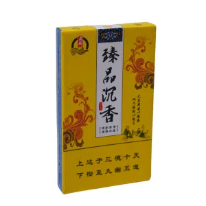
Պրեմիում Agarwood ծխախոտի փաթեթավորման տուփ
կատեգորիա: Ծխախոտի տուփԴիտումներ: 977սերիական համար:թողարկման ժամանակը: 2025-09-27 14:49:46Այս «Qifu» ապրանքանիշի «Premium Agarwood» ծխախոտի փաթեթավորման տուփը նուրբ արվեստի գործ է, որն անխափան կերպով միախառնում է ավանդական արևելյան գեղագիտությունը ժամանակակից դիզայնի լեզվով: Իր վառ գույների, նուրբ վարպետության և խորը մշակութային սիմվոլիզմի միջոցով այն կառուցում է տեսողական աշխարհ, որը և՛ ճոխ է, և՛ հարուստ մարդասիրական ոգով իր կոմպակտ չափսերում: Փաթեթավորման հիմնական երանգը վառ, շլացուցիչ դեղինն է՝ համարձակ և խորապես խորհրդանշական ընտրություն: Ավանդական չինական մշակույթում դեղինը կայսերական գույնն է, որը խորհրդանշում է գերագույն ուժը, փայլը և ազնիվ շքեղությունը: Երբ կիրառվում է փաթեթավորման վրա, այն ակնթարթորեն ներծծում է արտադրանքը արտասովոր ներկայությամբ և կենսունակությամբ՝ այն առանձնացնելով լեփ-լեցուն դարակների վրա՝ հզոր տեսողական ազդեցությամբ: Այս գույնը ոչ միայն հաղորդում է արտադրանքի պրեմիում դիրքը, այլև ակնարկում է դրա բարձրակարգ որակը, որը նման է «կայսերական առաջարկին»: Այս բացառիկ հյուսվածքին հասնելու բանալին դաջվածքի տեխնիկայի վարպետորեն կիրառման մեջ է: Այս պրոցեսը օգտագործում է ճշգրիտ կտրվածք՝ թղթի մակերեսի վրա հստակ ռելիեֆային էֆեկտներ ստեղծելու համար: Լինի դա առջևի վահանակի տեքստը և կնիքը, թե ծայրերի շուրջը գտնվող բարդ նախշերը, յուրաքանչյուր տարր ձեռք է բերում եռաչափ խորություն և նուրբ շոշափելի որակ: Ձեր մատները մակերեսի վրայով անցնելով՝ դուք հստակ զգում եք նախշերի ուրվագիծը: Այս ինտերակտիվ փորձը, որը գերազանցում է տեսողությունը, զգալիորեն բարձրացնում է փաթեթավորման նրբագեղությունը և ձեռագործ ջերմությունը՝ ցուցադրելով ապրանքանիշի մանրակրկիտ ուշադրությունը մանրուքների նկատմամբ: Առջևի վահանակի դիզայնի դասավորությունը խիստ է, տեղեկատվությունը հստակորեն կազմակերպված է շերտերով: Սպիտակ տարածությունը խելամտորեն ձևավորում է տեսողական կիզակետ, որը նման է նկարի բացասական տարածությանը, ինչը թույլ է տալիս հիմնական հաղորդագրությունը հստակորեն առանձնանալ: Այս տարածքում «Zhenpin Chenxiang» (Premium Agarwood) համարձակ սև նիշերը հայտնվում են առույգ և տպավորիչ՝ ուղղակիորեն ընդգծելով արտադրանքի հիմնական հատկանիշները և բացառիկ գնահատականը: Հարակից կարմիր կնիքի ձևավորումը, որը հիմնական ավանդական չինական տարր է, ծառայում է որպես որակի կնիք՝ ավելացնելով արժանահավատություն և դասական հմայք ապրանքանիշին: Առավել գրավիչ են կարմիր-շագանակագույն միահյուսված նախշերը, որոնք շրջապատում են սպիտակ տարածքը: Այս բարդ ձևավորումները, որոնք պարունակում են հեղուկ, պտտվող գծեր, որոնք կարող են միախառնել ավանդական ոլորանները, որթատունկի նախշերը կամ բարենպաստ ամպերի մոտիվները, սիմետրիկ դասավորված են: Ինչպես ժապավենները, որոնք շրջապատում են հիմնական ուղերձը, նրանք ընդհանուր դիզայնը ներարկում են դինամիկ շարժումներով, բարենպաստ սիմվոլիզմով և հարուստ դեկորատիվ գեղեցկությամբ՝ զգալիորեն բարձրացնելով փաթեթավորման գեղարվեստական գրավչությունը: Փաթեթավորման վրա տեքստային տարրերը խոր իմաստ են կրում՝ ցուցադրելով հարուստ մշակութային խորություն: Վերևի ձախ անկյունում գտնվող «Mingfu» ապրանքանիշի լոգոն, որը զարդարված է հոսող ամպերի նախշերով, խորհրդանշում է բարձր բարեկեցությունը: Աջ կողմում ուղղահայաց դասավորված տեքստը՝ «Երբ դրախտը առաքինի է, այն առաջացնում է գետի կապույտ փիղը, երբ երկիրը ընդարձակ է, նա դաստիարակում է գետի որդուն», և ներքևում գտնվող «Հասնելով դեպի վեր դեպի երեք թագավորություններ և տասը երկինք, ներթափանցելով դեպի ներքև՝ մինչև ինը ուղիներ, ներկայացված են նրբագեղ ոճով» արտահայտությունը: Այս արտահայտությունները, իրենց կատարյալ զուգահեռականությամբ և մեծ պատկերացումներով, կարծես թե մարմնավորում են տիեզերական իմաստությունը և համընդհանուր ճշմարտությունները: Դրանք ոչ միայն զգալիորեն բարձրացնում են փաթեթավորման մշակութային խորությունը և փիլիսոփայական հնչեղությունը, այլև խելամտորեն արձագանքում են «ագառափայտի»՝ որպես սուրբ խունկի, հոգևոր էության հետ՝ ստեղծելով տրանսցենդենտալության և խորը առեղծվածային մթնոլորտ: Ընդհանուր դիզայնը վարպետորեն միավորում է ազնիվ երանգները, եռաչափ վարպետությունը, բարենպաստ մոտիվները և խորը գեղագրությունը: Այն հաջողությամբ ստեղծում է պրեմիում բարձրակարգ ծխախոտային արտադրանքի պատկեր, որը և՛ էլեգանտ է, և՛ ազնիվ, բայց խորապես արմատավորված է ժառանգության մեջ: Այս լուռ պատմությունը խոսում է ապրանքանիշի խորը մշակութային ժառանգության և բացառիկ ճաշակի ձգտման մասին:


նորություններ
Դասակարգում:
Որոնման արդյունքներ դեռ չկան:
այն դեպքն է
Դասակարգում:
Որոնման արդյունքներ դեռ չկան:
տեսանյութ
Դասակարգում:
Որոնման արդյունքներ դեռ չկան:
բեռնել
Դասակարգում:
Որոնման արդյունքներ դեռ չկան:
հավաքագրում
Դասակարգում:
Որոնման արդյունքներ դեռ չկան:
Առաջարկվող ապրանքներ
-
NEWS
Yanshuang Monk Fruit Lozenges փաթեթավորման տուփ
իմանալ ավելին -
NEWS
J IU and TI press ապրանքանիշի ծխախոտի տուփ
իմանալ ավելին


 Հեռախոս